/e/OS and the (not)Android user interface
Here I’m talking about the /e/OS approach regarding the user interface, and upcoming changes.

It might seem odd that at /e/, we put some energy and some development effort into the end-user user interface. We are a pro-privacy, deGoogled, mobile operating system, right?
The reason behind this, is double:
1- one is pragmatic: we want /e/OS to get the widest possible adoption, and for this, we need a beautiful OS, with a modern, clean and attractive UI, and the best possible user experience.
2- the other one is not pragmatic, and even a bit selfish: since NeXTStep was born, I have a personal taste for great graphical interfaces. And this already impacted my two previous projects Mandrake Linux, which has been the first desktop Linux distribution, and Ulteo, which was a desktop delivery solution.
/e/OS is based on the open-source Android operating system, which has its own launcher. It’s usable but can’t be considered as very attractive. And looking at the big smartphone names on the market (e.g. the ones that sell *a lot* of smartphones, like Samsung, Huawei, Xiaomi), it is quite clear that they put a lot of efforts to bring a better, more attractive, user interface into their OS. Something sometimes very far from the traditional Android user interface.
So I have explained since the project inception (read “The design point”) that /e/OS would care about the UI too, because I have a strong intuition that most users won’t consider using /e/OS if it looks too old or offeres a too complicated user experience.
/e/OS “Bliss Launcher”…
That’s the reason why we have started to developer Bliss Launcher from scratch at the begining of the project. And not surprisingly, though a few find it too far from the stock Android experience and will replace it by another launcher (it’s easy), it’s generally enjoyed by most /e/OS users.

And we keep on improving it: soon, we will have the top bar cleaned from all the notification icons from system and apps. The reason for this is to avoid to have a cluttered (and therefore totally useless for most users) top bar look like this:

In the near future, there won’t be any notification icons in the top-bar. Instead we will have all “network”-related icons (cellular, wifi, bluetooth…) on the top left, time at the center, and battery level on the right. For devices with a central notch, time will go on the right.
It will look like something like this:

For those who fear the lost of those notification icons in the top bar: relax!
1- notification will still show up a few seconds on the main screen when they arrive (unless the user disables this in settings)
2- notifications will still show up and stack on the lock screen (until the user deletes them manually).
3- because we are super-cool with hard-core Android users, /e/OS will have a button in settings so that a user can revert this feature, and enables again full notifications in the top bar.
… and UI consistency
We’re going deeper in the user interface. One of the things that I wanted to improve in /e/OS is the user interface consistency (colors, widgets, …) in /e/OS default applications, like Calendar, Messages, Notes, etc.
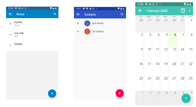
For instance, let’s have a look at three default applications: Notes, Contacts and Calendar. Here is how it looks at the moment:

We see that the colors are not consistent at all: some all-blue design for Notes, some other blue with a red-purple button for Contacts, mostly some green in Calendar. We need more consistency accross default applications, and not only for colors.
So we have developed a new SDK for /e/OS where we are going to define all the default colors, default fonts, default widget to use in applications, and modify those apps to adopt a common look and feel:

And this will also let users who want this, to set a dark theme that will immediatly apply to all default applications.
Of course, this is only the begining, we will do other changes so that we can offer one of the best mobile phone user interface to /e/OS users.
And never forget: Your data is YOUR data!
Stay tuned.
Gaël
Follow me on @gael_duval on Twitter, @gael@mastodon.social on Mastodon.


